SEEING THINGS DIFFERENTLY : An Alphabet of Haverfordwest
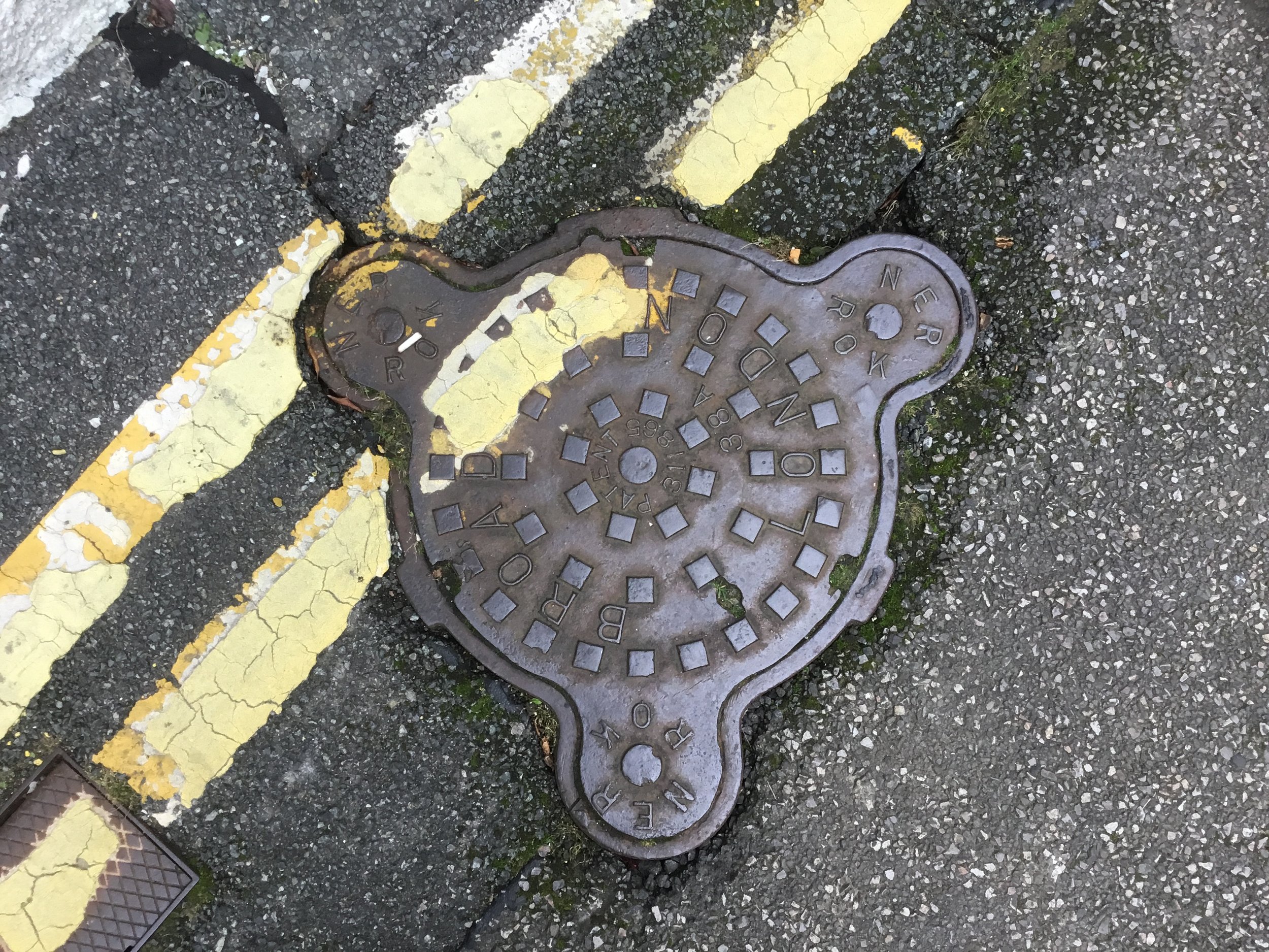
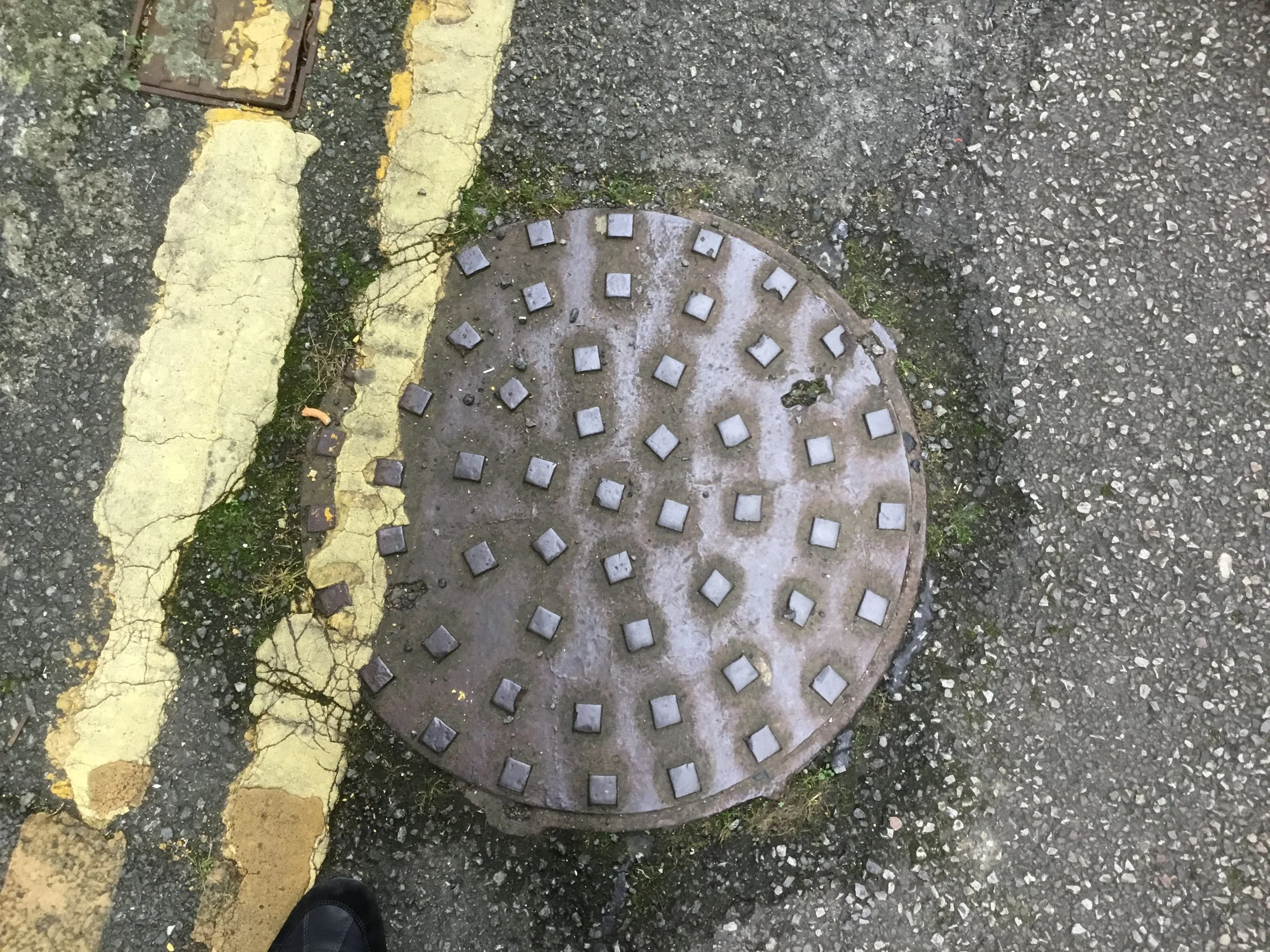
This idea arose between two artists engaged in thinking about how to improve life in our town of Haverford. One, Richard Blacklaw-Jones, is obsessed with making “better use of what we’ve got“ – the physical things of the town, its signs, the street furniture, the typography of the business signs and so on. The other, Heidi Baker, an experienced and successful graphic designer and founder of Popty Press, passionate about traditional handmade printmaking techniques. Around them they saw opportunities. Firstly they took prints of some of Haverford’s opercula. What’s that we hear you chorus? An operculum is the thing that closes a hole, usually in the floor. So in the context of our project it could be a drain cover, a coal hole cover and so on. Usually made of cast iron and often quite decorative. Keep your eyes down while walking the streets of Haverfordwest and you’ll see what we mean…


We enjoyed a couple of print outings where we took prints in situ, careful to use only non-toxic inks and to clean up after ourselves.

These print patterns were then digitised and held in readiness.
Following on from this joyful print experience, Richard started collecting examples of letterforms from the signs of Haverfordwest. Some are hand-painted so are essentially unique. Some have been made using stencils and perhaps a bit more generic. He started to hatch a plan to make an entire alphabet from the various business names, street names, historic plaques , building names, etc. The chosen letters were then cut from a scrap roll of vinyl flooring left over from a bathroom flooring job (thank you Jo Sayers). Once the letters were cut he printed the entire alphabet with thanks to Tim Hughes and his glorious Albion press.
An Alphabet of Haverforwest, Richard Blacklaw-Jones, 2024


Richard’s final alphabet print (above) will be on show at the Haverford Pressed! exhibition at HaverHub starting 10 August 2024.
This led to the idea of making an A to Z of Haverfordwest booklet. We decided to test out the idea by making the first page design ‘A is for Alderwicks’ and submit this as our response to the Haverford Pressed! miniprint project.

Alderwicks was a soft drinks company established in 1921 in the centre of Haverfordwest, moving to the outskirts in the 70s. After nearly a hundred years of manufacturing traditional, bottled lemonade and ginger beer the company closed its doors in 2017.


Here is our ‘A is for Alderwicks’ print hot off the press. To make these prints, we first silkscreen printed the background pattern – taken from a drain cover we discovered in front of the old Tasker’s schoolhouse on Tower Hill. We then printed the vinyl ‘A’ on an etching press and then printed the rest of the type using metal letters on a proofing press.
This is just the start! Our intention is make a small booklet of the entire alphabet for Haverfordwest. All of the elements of the illustrations can be found in Haverford’s streets. We’ve realised: the first step is to LOOK and, when we begin to see what there is, we start to see things differently, which in turn leads to new ideas.
Heidi Baker and Richard Blacklaw-Jones, July 2024